Collecting, sorting, and understanding data gathered during user research and usability testing is becoming an increasingly common task among UX practitioners—in fact, it’s becoming a critical UX skill.
A usability test will tell you whether your target users can use your product. It helps identify problems people have with a specific UI, and reveals difficult-to-complete tasks and confusing language. Typically, a usability test involves extensive preparation and analysis, and is regarded as one of the most valuable research techniques. It’s able to provide both quantitative and qualitative data that will help guide the product team towards better solutions.
However, it’s not a walk in the park. In an attempt to discover usability problems, UX researchers and designers often have to cope with a deluge of incomplete, inaccurate, and confusing data. A regular usability test with five to ten participants can easily generate more than sixty issues. It can feel like “drinking from the firehose” while waiting for the feared analysis paralysis to rear its ugly head.
A considerable risk when trying to solve usability problems is going down the wrong track trying to come up with solutions that don’t truly address the issues at hand. The risk is that there may be a disconnect between issues found and solutions identified. These can be caused by a number of different factors, including decision fatigue and many types of cognitive biases.
How to Turn Usability Testing Data into Workable Solutions
In order to master the obstacles mentioned above, we need efficient ways to handle our testing data while making sure we choose the most effective solutions for the issues found.
Let’s start by borrowing some ideas from the creative process. One of the most powerful is the double diamond from The British Design Council, which in turn uses divergent-convergent thinking. It is a design process with clearly defined and integrated problem and solution phases.
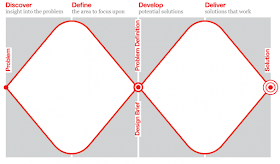 |
| Divided into four distinct phases---discover, define, develop, and deliver---the double diamond is a simple visual map of the design process. (© The British Design Council, 2005) |
The double diamond is exactly what we need to build a framework that will handle the usability issues and find ways to solve them.
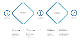
Adapting the model above to usability testing of the result is a four-step process:
- Data collection
- Issue prioritization
- Solution generation
- Solution prioritization
Note: We will need to use some basic math. Don’t worry, it’s not too much, and at the end of this article, you’ll find a spreadsheet that automates the whole process. If it’s still not working for you, there is also a visual approach where you can use Post-its and whiteboards.
Step 1: Usability Research Data Collection
Starting with your research questions, the first step is to collect the data generated by the usability test. It needs to be set up for easy idea generation and insights later in the process—the key is to clearly structure and organize the data to avoid clutter. In most cases, it’s sufficient to:
- Have an issue identification (ID) system
- Note where it happened (screen, module, UI widget, flow, etc.)
- Know the task the user was engaging in
- Provide a concise description of the issue
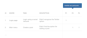
A common approach for organizing usability issues, used by Lewis and Sauro in the book Quantifying the User Experience, is to plot the data as shown in the table below, with issues in the rows and participants in the last few columns.
In the example above, a fictional usability test made with three participants yielded two issues:
- The first experienced by the participant one (P1)
- The second by the other participants (P2 and P3)
Step 2: Issue prioritization
As resources are limited, it is necessary to prioritize usability issues in a way that will optimize analysis. Typically, each usability problem has a grade of severity, influenced by some factors like:
- Task criticality: Rated in terms of impact on the business or the user if the task is not accomplished.
- Issue frequency: How many times an issue has occurred with various participants.
- Issue impact: How much has it impacted the user trying to accomplish the task.
To prioritize, we need to follow these steps:
- Set the criticality score of each task performed in the test. Simply put, define how critical the task is for the business or user by setting a numeric value to it. The values may come from a simple linear sequence (e.g., 1, 2, 3, 4, etc.) or something more elaborate like the Fibonacci sequence (1, 2, 3, 5, 8, etc.), exactly as used in agile methods like planning poker.
- Set the impact score for each issue by assigning a value (same as above) for items in this scale:
5: (blocker) the issue prevents the user from accomplishing the task
3: (major) it causes frustration and/or delay
2: (minor) it has a minor effect on task performance
1: (suggestion) it’s a suggestion from the participant
3. Find the issue frequency (%) of the issue by dividing the number of occurrences by total participants. It’s a basic percentage calculation.
3. Find the issue frequency (%) of the issue by dividing the number of occurrences by total participants. It’s a basic percentage calculation.
4. Finally, calculate the severity of each issue by multiplying the three variables above.
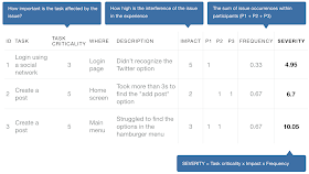
Let’s see how it works in a spreadsheet (of course we want to automate this, right?). Our updated table would look like this:
In the example above, we have the following scenario:
- Three usability issues experienced by three participants (p1, p2 and p3);
- The task ‘create a post’ appearing twice and assigned a critically of 5, and a less critical task (social login) assigned a 3;
- Each issue was assigned a value given its impact: 5 (blocker), 3 (major) and 2 (a minor impact on task performance);
- The frequency of each issue (e.g., issue no. 2 occurred twice with three participants, thus 2/3 = 0.67);
- Finally, the severity resulted from the multiplication of the other factors (e.g., 3 x 5 x 0.33 = 4.95).
Let’s move ahead and find some solutions for those issues.
Step 3: Solution Generation
Typically, usability tests aren’t complete at the conclusion without a list of recommendations (generic suggestions) and solutions (specific instructions). Sometimes the solution is quite obvious—like correcting the placement of a UI component. The situation becomes trickier for those issues with non-obvious or many possible solutions. Which solution is better? Which one is more feasible? What is the cost/benefit of running an experiment to find out? Here, the traditional method of regular recommendations will not suffice.
To reduce the risk of making bad design decisions, we need: a) several solution alternatives to choose from, and b) an effective selection process. We’re going to use the same divergent-convergent approach used to tackle the data collection and issue prioritization steps in the previous phase. The steps are:
- For each issue, generate multiple solution ideas—What are possible ways to address the issue? Here, we have a great opportunity for collaboration with the rest of the team (developers, designers, product managers, etc.).
- Reorganize the solutions, keeping them specific—as required, merge or split the solutions to avoid redundancies and too much abstraction. Again, be specific, so that it’s easier to evaluate ideas. For example, instead of just “Avoid using a hamburger menu,” it’s better to state a specific solution, such as “Use a horizontal navigation and vertical tree menu.”
- Mark additional issues that the solution may address—in practice, a single good solution can address multiple issues. Good solutions are versatile!
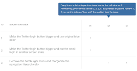
In this example, we have the list of brainstormed solutions (rows), and the issues that each solution addresses (columns, that represent the issues found in the previous steps).
Next, let’s see how to evolve this list and find out which solutions are the best candidates for implementation, and in which order.
Step 4: Solution Prioritization
Similarly to issue prioritization, we need to prioritize solutions according to some parameters. In agile teams, where this subject is treated very seriously, it’s common to use business value and complexity, which lets us calculate the return on investment (ROI). Borrowing from this logic, we have the following steps:
- Calculate the effectiveness of each solution.
The more severe the issue addressed, the better the solution. This could be roughly compared to the business value in agile methods. Add up the severities of all issues addressed by the solution.
Effectiveness = Sum of issue severities
2. Hone the complexity of the solution.
- What are the resources required to develop this solution?
- How standard are the technologies involved?
- How clear are the business/user requirements?
In other words, the more effort and uncertainty, the more complex the solution. Just translate this into a quantifiable value, like the Fibonacci sequence (1, 2, 3, 5, 8, etc). If you are doing this as a team, planning poker fits perfectly.
3. Calculate the ROI of the solution. This is the cost-benefit relationship, calculated by dividing the effectiveness of the solution by its complexity. The higher the ROI, the better.
ROI = Effectiveness / Complexity
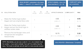
Let’s go back to our spreadsheet, which now looks like this:
In the example above, we have:
- The list of solutions (rows)
- The issues (i1 to i3) with their severities (4.95, 6.7 and 10.05)
- An indicator of 1 every time a solution matches (addresses) an issue
- The effectiveness of each solution (4.95, 4.95 and 16.75)
- The complexity of each solution (1, 3 and 5) estimated by the team
- The ROI of each solution (4.95, 1.65, 3.35)
According to this example, we should prioritize the development of the solutions in the following order (from the higher to lower ROI): solution 1, then solution 3 and 2.
To summarize the steps: we started by collecting data, then we prioritized issues according to specific parameters. Afterwards, we generated solution ideas for those issues and, finally, prioritized them.
Using a Spreadsheet
The method above involves some (basic) calculations repeated many times, so it’s best to use a spreadsheet.
If you want to follow this methodology, here’s a template (Google Sheet): https://goo.gl/RR4hEd. It’s downloadable, and you can freely customize it to your needs.
I Hate Spreadsheets! What About Something More Visual?
Nearly everyone I know (including me—of course) loves working with sticky notes and whiteboards, not only because it’s usually faster and fun, but also because it facilitates collaboration. If you are an agile or design thinking practitioner, you know what I mean. How can we apply visual tools like sticky notes to work with the approach shown in this article? Well, that probably deserves an entire blog post, but let’s try to scratch the surface.
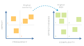
One way to do it is to create a matrix for issues (impact x frequency) and place it next to another for solutions (effectiveness x complexity). Each matrix is divided in four quadrants, indicating prioritization.
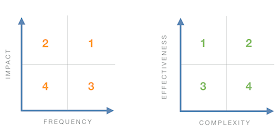 |
| The Issue Matrix and Solution Matrix |
Here are the steps:
- Create the issue matrix by placing the sticky notes in the proper quadrant according to impact and frequency. In order to simplify this approach, we had to leave one parameter out. In this case, task criticality.
- Create the solution matrix by organizing the sticky notes according to each solution’s effectiveness and complexity:
- Brainstorm solutions for each issue, starting with the issues in quadrant 1 of the issue matrix (the ones with higher severity).
- Place these solutions in the solution matrix, starting at quadrant 1 (top left). The more severe the issue, the more effective its solution.
- Adjust the complexity of each solution by moving it on the horizontal axis (the more complex, the further to the right).
- Repeat the steps above for the remaining issues (quadrants 2, 3 and 4, in this order).
At the end of the exercise, the solutions in quadrant 1 are the ones with best ROI (more effective and less complex) signifying top priority. The result is shown in the image below:
Including the fact that we left one parameter out (task criticality), the downside here is that you have to rely on visual accuracy instead of calculations as in the spreadsheet. On the positive side, we have a method that fosters collaboration—which is sometimes crucial to getting buy-in from the team.
Fostering collaboration through “quick and dirty” visual analysis at the likely cost of accuracy is a potential trade-off. Which is the better approach? The short answer: the one that best fits your situation and is best aligned with your goals.
Final Takeaways for Usability Testing Data Analysis
Using these methodologies brought up the following observations from teams who used it in various projects:
- Especially when dealing with bigger studies, the issue prioritization keeps the team focused on what really matters, saving time and resources by reducing unwanted cognitive challenges like information overload, analysis paralysis, and decision fatigue;
- The connected end-to-end workflow keeps solutions more aligned with usability test outputs (because issues and solutions are paired), reducing the risk of implementing less-than-optimal solutions;
- We can easily apply this method collaboratively (in part or as a whole) using online tools.
It’s important to understand the limitations of this approach. For instance, during the prioritization phase, the positive attitudes and behaviors of the users observed in testing are not included. The focus is on usability issues. One suggestion is to log this kind of data separately, and to use it along the way to complement and balance the findings as needed.
Finally, apart from usability testing, this approach can also be extended to other UX research techniques. Applying the ‘double-diamond’ approach (diverging/converging problems and solutions), we can mix various user research data and use the methods above in any other project. Your imagination is the limit!
About the author
CARLOS ROSEMBERG
Source: toptal.com

0 comments:
Post a Comment